Let’s talk about classification.
Table of Contents
Context and Simulation
Logistic regression can be used as a classifier for a dichotomous outcomes (live/die), but ultimately you need to specify the threshold probability that demarcates outcomes.
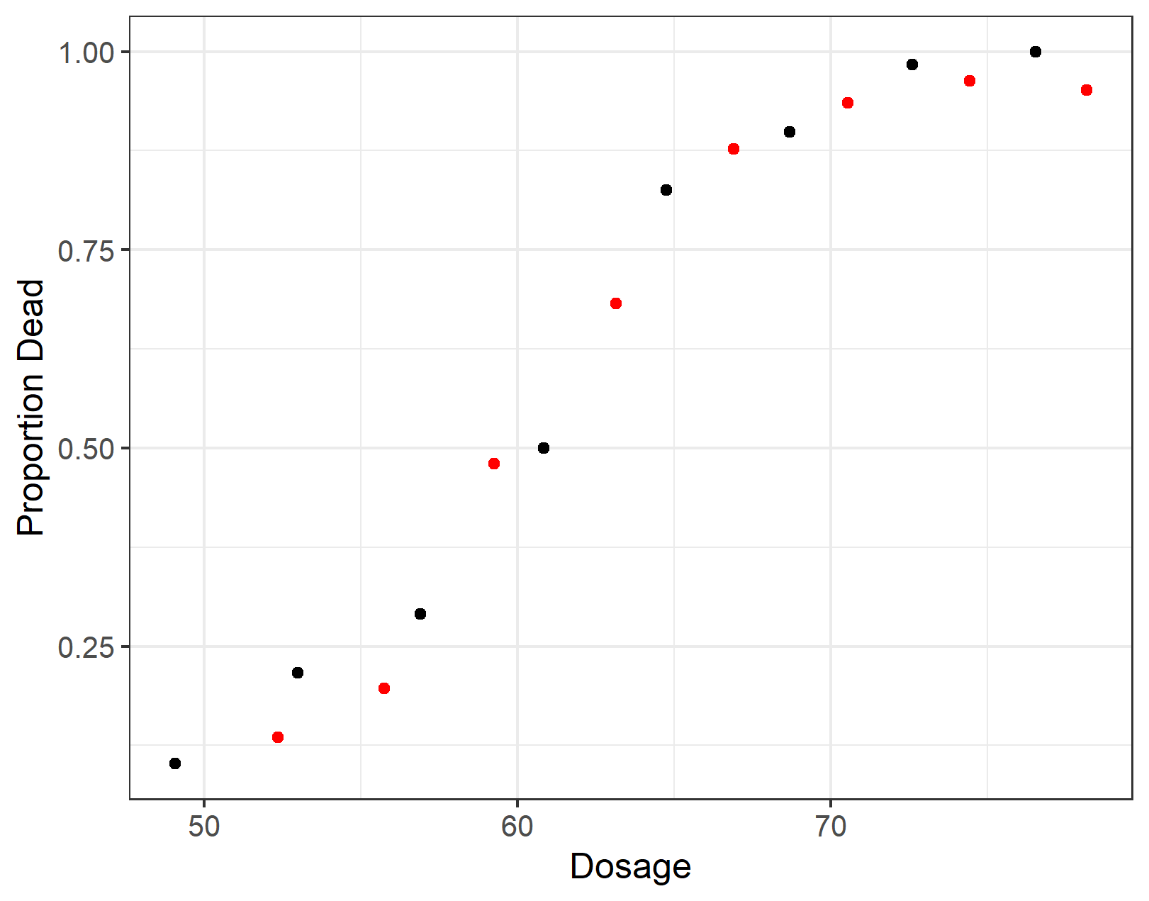
The SMPracticals R package contains bliss, a dataset detailing the number of adult flour beetles which died following a 5-hour exposure to gaseous carbon disulphide. Here the outcomes are died versus lived, with died as the success evemt. The data is aggregated showing number of beetles that died at a given dose, but we the individual trials. So, let’s fit a logistic regression model to the bliss data and then simulate bernoulli trials from the resulting model using simstudy. If nothing else, it is fun and somewhat educational.
pacman::p_load(SMPracticals,
               simstudy,
               tidyverse)

data(bliss)
bliss$prop_dead = bliss$r / bliss$m

summary(lm1 <- glm(cbind(r, m-r) ~ dose, data = bliss, family = binomial))

# Simulate based on the above parameter estimates

n_obs <- sum(bliss$m)
def <- defData(varname = "dose", dist = "uniform", formula = "50;80")
def <- defData(def, varname = "death", dist = "binary", formula = "-14.8084 + 0.2492 * dose", link = "logit")
set.seed(555)
dt_1 <- genData(n_obs, def)
dt_1

# Add a categorical treatment exposure

dt_1$discrete_dose <- cut(dt_1$dose, 8)

# Aggregate by dosage and death

dt_2 <- dt_1[, .(.N, mean(dose)), keyby = .(discrete_dose, death)]

# Select the stuff we need into a wide format

dt_3 <- cbind(dt_2[death == 1, .(deaths = N, dose = V2), ],
              dt_2[death == 0, .(survived = N), ])

# Compute the prop_dead in the simulated model and the empirical logit (see later)

dt_3[, prop_dead := deaths / (deaths + survived)]
dt_3[, elogit := log(prop_dead/(1-prop_dead)) ]

# Empirical comparison

ggplot(data = bliss, aes(x = dose, y = prop_dead)) +
  geom_point() +
  geom_point(data = dt_3, aes(x = dose, y = prop_dead), colour = "red") +
  ylab("Proportion Dead") + xlab("Dosage")

# Model in long form

summary(lm2 <- glm(death ~ dose, data = dt_1, family = binomial))
Here’s a look at the original bliss data and the aggregated form of the long dataset dt_1. The red dots are from our simulated data. The new data has slightly different dose categories but roughly the same overall curve. Note that from hereon in, I am only working with the simulated data.
While we intend logistic regression as our method of choice we haven’t deliberated on the appropriateness of this model. If we have a single predictor then a fundamental assumption is that the logit (the log odds) is linear, that is we assume:
$$ \text{logit}(death = 1 | \text{dosage}) = \beta_0 + \beta_1 \text{dosage} $$
Fortunately, empirically, our simulated data aligns with the linearity assumption:
ggplot(data = dt_3, aes(x = dose, y = elogit)) +
  geom_point() +
  geom_smooth(se = F, method = "lm") +
  ylab("Empirical logit: log(p/(1-p))") + xlab("Dosage")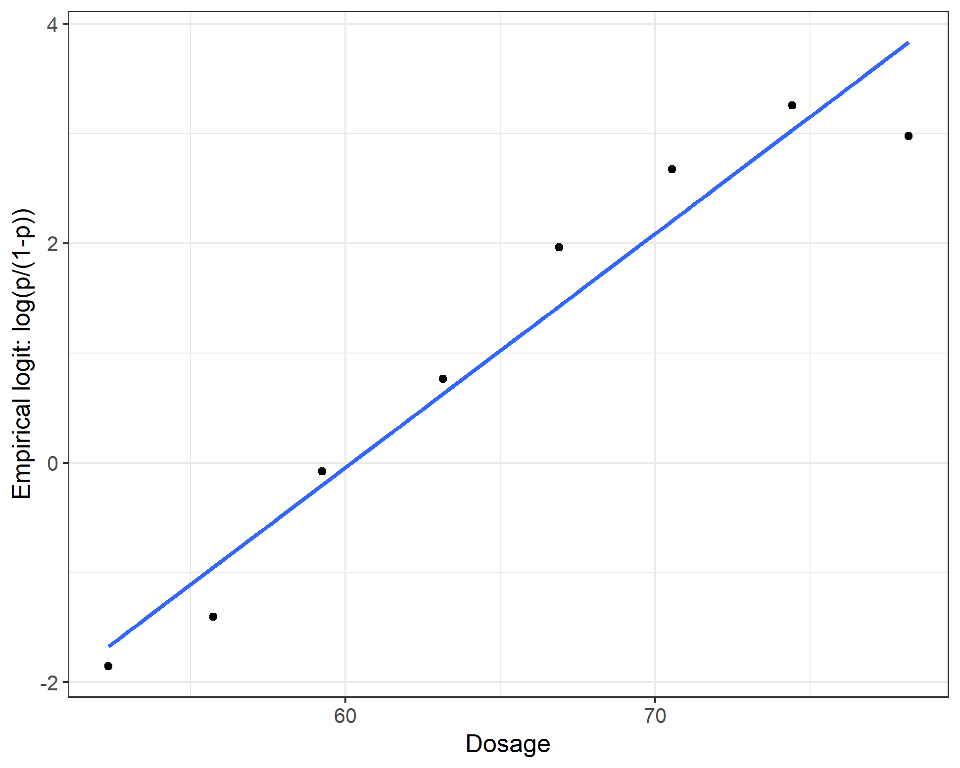
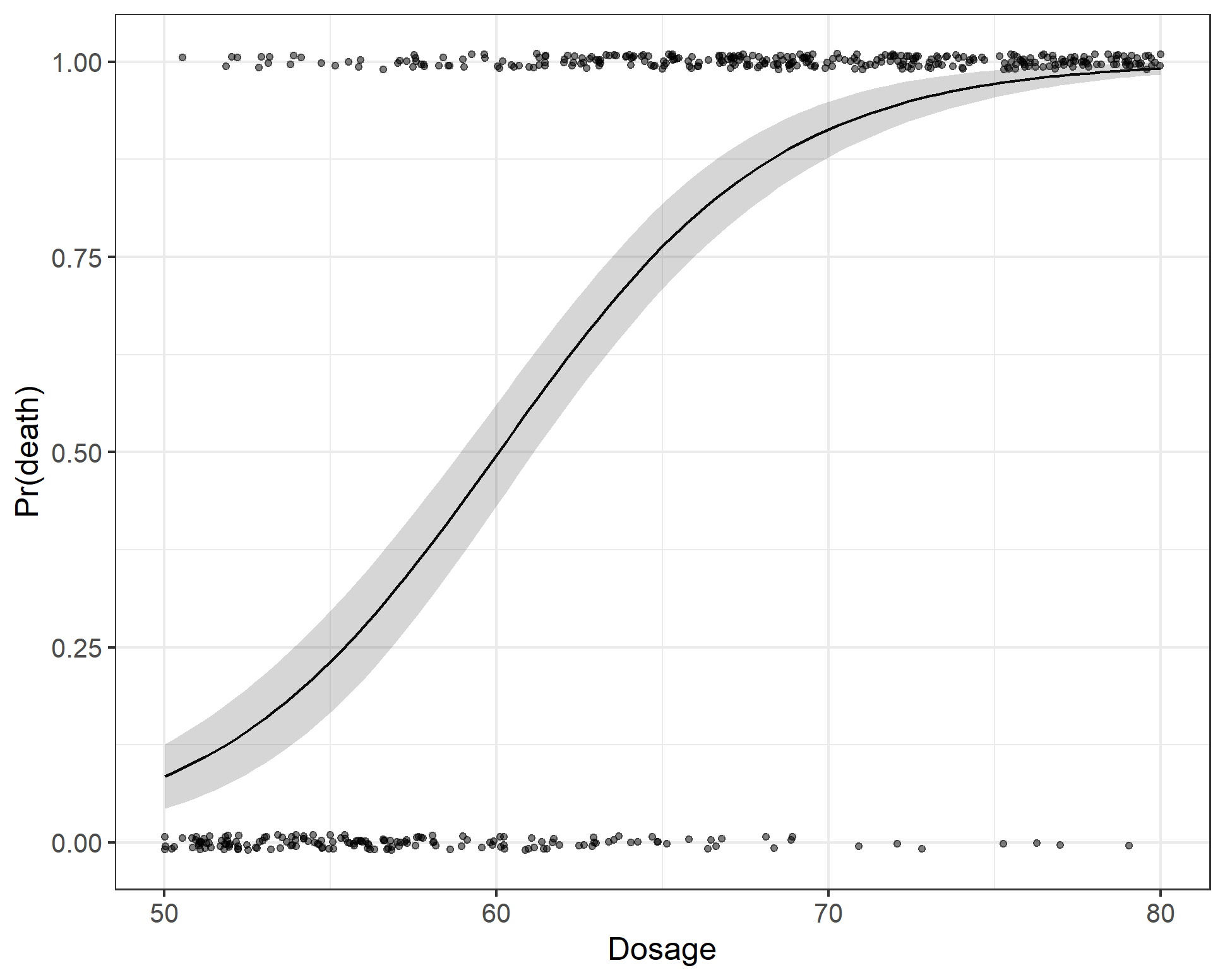
Inspecting the results from the regression models we can see that lm1 and lm2 give similar parameter estimates (different degrees of freedom obviously). And, whichever way you cut it, the exponentiated parameter estimate gives an odds ratio for dosage of about $1.27$. In other words, for a unit increase in dosage the odds of death increases by a factor of 1.3. But who understands odds-ratios, right? Another way to look at the results is to estimate the probability of death, which increases from 10% at a dose of 50, 55% at a dose of 60 and is around 94% at a dose of 70 units. However, the best way to understand what the model is saying is to simply draw a picture, shown below. We see the the instances of death as a function of dosage and the model predicted probability of death for an average beetle.
Sensitivity and specificity
In order to understand the ROC curve, you need to have a working idea of sensitivity and specificity. Sensitivity gives us the proportion of deaths that were predicted as deaths and specificity gives the proportion of beetles that we predicted would live that actually lived. These are sometimes called the true positive and true negative rate. We will also encounter another related concept - the false positive rate = 1 - specificity. To cement these ideas, let’s say that we decide that we are going to say that if a beetle is given a dose of 65 then we predict that it will die (corresponding to a probability threshold of 0.76). We can easily see how right/wrong we are by updating our data with a predict death field.
dt_1[, predict_death_1 := dose >= 65]

# Or equivalently work out the corresponding threshold probability

# from our model and do:

# dt_1[, predict_death := dose>=threshold]


with(dt_1, table(death, predict_death_1))| Predicted | Death (No) | Death (Yes) | |
|---|---|---|---|
| Predicted (No) | 150 | 87 | 237 |
| Predicted (Yes) | 17 | 227 | 244 |
| 167 | 314 | 481 |
Table: Threshold poison to predict death: 65 units
The sensitivity is $\frac{227}{314} = 0.72$, the specificity is $\frac{150}{167} = 0.90$. However, if we chose to make our decision on a dose of 50 units of poison we would different. For example, if the threshold poisson dose was 55 units (analogously a probability threshold of 0.23) the sensitivity increases to $\frac{302}{314} = 0.96$, the specificity falls to $\frac{69}{167} = 0.41$.
| Predicted | Death (No) | Death (Yes) | |
|---|---|---|---|
| Predicted (No) | 69 | 12 | 81 |
| Predicted (Yes) | 98 | 302 | 400 |
| 167 | 314 | 481 |
Table: Threshold poison to predict death: 55 units
ROC Curve
If we adopt the above procedure on all the possible thresholds for our data then we can plot a receiver operator charactistic (ROC) curve.
ggplot(dt_1, aes(d = death, m = prob_death)) +
  geom_roc(cutoffs.at = c(0.76, 0.23), labelround = 2) +
  scale_x_continuous(breaks = seq(from = 0, to = 1, by = 0.1)) +
  scale_y_continuous(breaks = seq(from = 0, to = 1, by = 0.1)) +
  ylab("True +ve Fraction (sensitivity)") + xlab("False +ve Fraction (1-specificity)")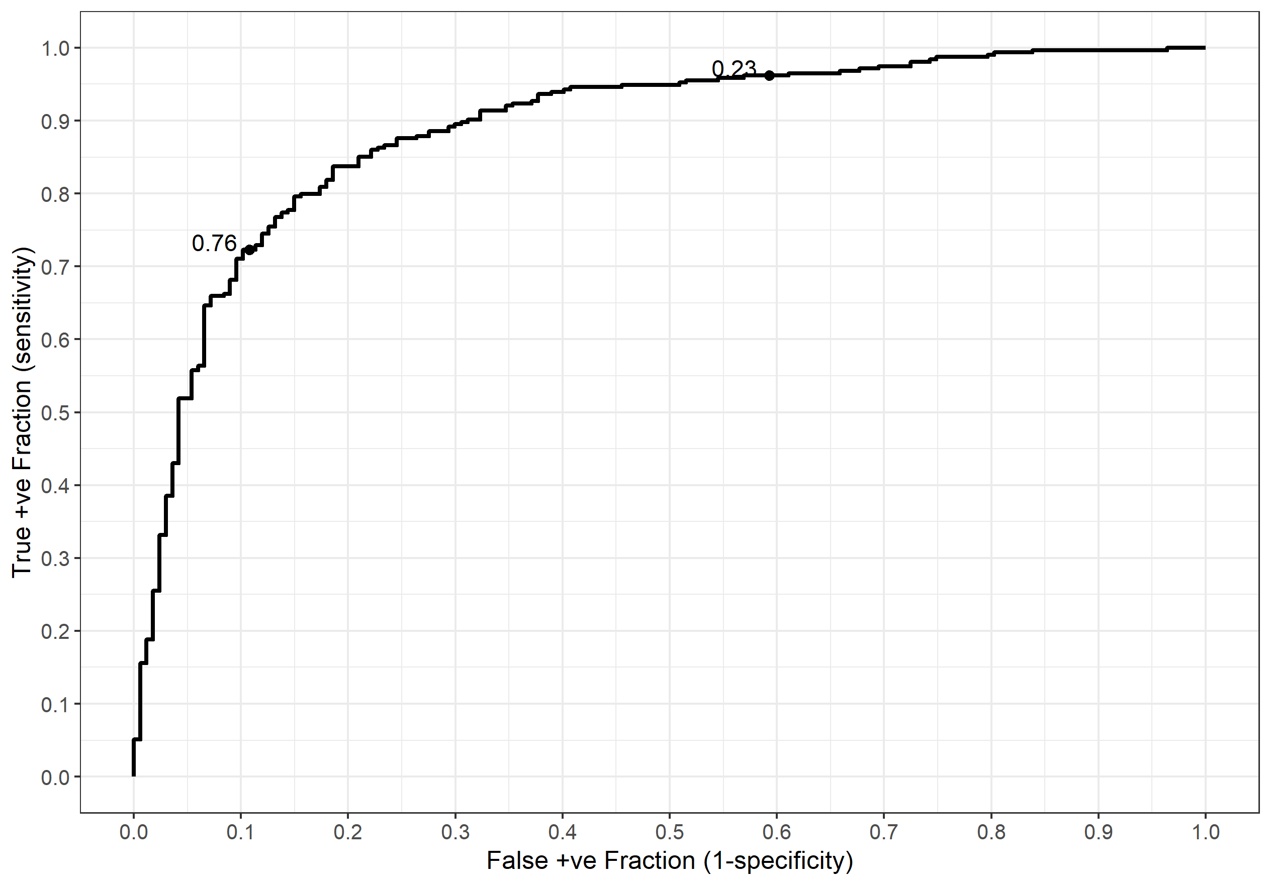
When presenting a ROC curve you should always add the thresholds (probability here) as shown above. If you neglect to do this then your curve is largely meaningless. We can verify our manual calcs (roughly) by looking at the threshold labels and seeing what the sensitivity and specificity are on the axes. In the case of a threshold of 0.76 the sensitivity and specificity are around 0.7 and 0.9 respectively (false positive fraction $1 - 0.9 = 0.1$) as we computed earlier. Similarly, the 0.23 threshold gives a sensitivity of around 0.95 and a specificity of about 0.4. Yay :)