The world is now awash in data, but sometimes it is useful to roll your own. For example, you may to look at ‘what if’ scenarios. Here I use publically available information on the age-class-distribution, rates of smoking and incidence of smoking to form a dataset that we will use in a later modelling exercise. In order to do this I use the simstudy and data.table R packages.
Distribution of lung cancer incidence in Australia
The Australian Institute of Health and Welfare publish incidence and mortality data. Data by cancer type is provided here. I downloaded the lung-cancer file, which originally looked like this:
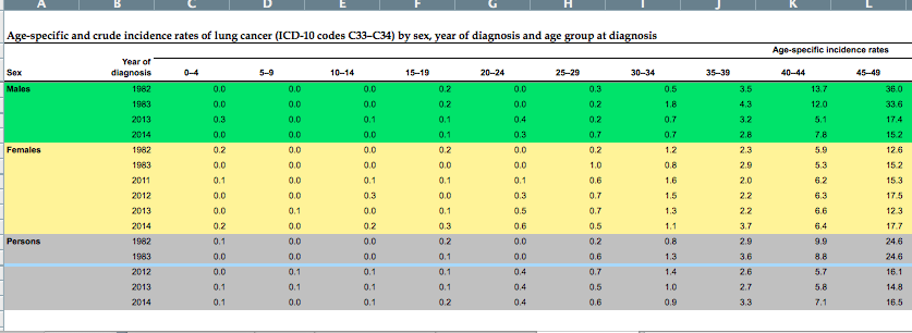
I copied the 2014 data for the males and females into a new spreadsheet and loaded it into R.
library(data.table)
library(readxl)

# see https://www.aihw.gov.au/reports/cancer/acim-books/contents/acim-books

dt.rates <- data.table(readxl::read_excel("rates.xlsx"), key="sex,age.bin")
head(dt.rates)
sex age.bin rate.per.100k
1: f 0 0.19356413
2: f 5 0.02926882
3: f 10 0.16013852
4: f 15 0.29336471
5: f 20 0.57427154
6: f 25 0.54157117
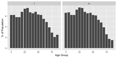
Table 6 from the data cube on Australian Demographics published by the ABS and found here gives the age class distribution by sex in Australia as at the end of 2017. Again, I copied the data I needed and ditched the rest.
dt.ages <- data.table(readxl::read_excel("rates.xlsx"), key="sex,age.bin")
head(dt.ages)
The age distribution across sex is similar with females living very slightly longer.
# http://www.abs.gov.au/AUSSTATS/abs@.nsf/DetailsPage/3101.0Jun%202017?OpenDocument

dt.ages <- data.table(readxl::read_excel("ageclass.xlsx"), key="sex,age.bin")
head(dt.ages)
Now I use the simstudy package to generate some new data. I assume that males and females are distributed 50:50 within the population. I only try to get an approximate
# Set the seed for reproducibility

set.seed(345)

# Create a definition for males and a separate one for females.

def <- defData(varname = "sex", dist = "nonrandom", formula = 1)
def <- defData(def, varname = "age.bin.idx",
               formula = paste0(dt.ages$prop[dt.ages$sex == "m"],  collapse = ";"),
               dist = "categorical")

n.pop <- 50000
dtm <- genData(n.pop, def)

def <- defData(varname = "sex", dist = "nonrandom", formula = 0)
def <- defData(def, varname = "age.bin.idx",
               formula = paste0(dt.ages$prop[dt.ages$sex == "f"],  collapse = ";"),
               dist = "categorical")
n.pop <- 50000
dtf <- genData(n.pop, def)

# Our working data set:

dt <- rbind(dtm, dtf)
dt$id <- 1:nrow(dt)

# Replace the sex var with something more readable

dt[, sex := ifelse(dt[,sex] == 1, "m", "f")]
dt[, age.bin := (age.bin.idx-1) * 5]

# For each age bin, which was modelled on the APS proportion of age

# class data, assign a random age between the start and end of age bin

# interval. Use a random uniform distribution.

dt[, age := runif(1, age.bin, age.bin + 4.999), by = id]

# Create an indicator for greater than age 18 to differentially

# assign a smoking probability.

dt[, age18 := ifelse(dt[,age] >= 18, 1, 0)]
dt[, psmk := ifelse(dt[,sex] == 1, 0.18 * dt[,age18], 0.14 * dt[,age18])]

# Bernouli trial to say whether smoker or not.

dt[, smk := rbinom(nrow(dt), 1,  prob = dt[,psmk])]
dt

# Set key in order to making joining trivial

setkey(dt,sex,age.bin)

# Left join by key

dt <- merge(dt, dt.rates, all.x=TRUE)

# Create the

dt[, cancer := rbinom(nrow(dt), 1,  prob = rate.per.100k/100000)]
dt
The end result looks like this:
       sex age.bin    id age.bin.idx        age age18 psmk smk rate.per.100k cancer
     1:   f       0 50003           1  1.9907349     0 0.00   0     0.1935641      0
     2:   f       0 50036           1  4.8925030     0 0.00   0     0.1935641      0
     3:   f       0 50043           1  0.9762412     0 0.00   0     0.1935641      0
     4:   f       0 50046           1  3.8317576     0 0.00   0     0.1935641      0
     5:   f       0 50048           1  3.4270826     0 0.00   0     0.1935641      0
    ---
 99996:   m      85 49289          18 89.3857581     1 0.14   0   450.0924556      0
 99997:   m      85 49326          18 86.2884594     1 0.14   0   450.0924556      0
 99998:   m      85 49330          18 89.6440606     1 0.14   1   450.0924556      0
 99999:   m      85 49373          18 88.3372412     1 0.14   0   450.0924556      0
100000:   m      85 49928          18 86.4949185     1 0.14   0   450.0924556      0
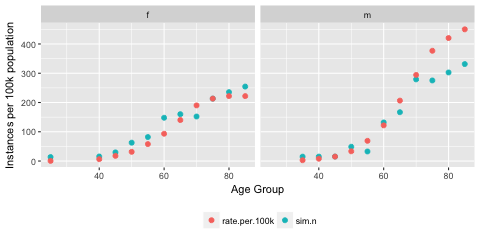
As a very quick and dirty sanity check (always do a sanity check of some kind) we can compare the number of cancer cases in our simulated data with the rates we obtained earlier by scaling up each sex by age bin group. For example:
# Sanity

df.san <- as_data_frame(dt)
df.tmp <- df.san %>%
  dplyr::group_by(sex, age.bin) %>%
  dplyr::summarise(scale = 100000 / n())

df.san <- df.san %>%
  dplyr::filter(cancer == 1) %>%
  dplyr::group_by(sex, age.bin) %>%
  dplyr::summarise(sim.n = n()) %>%
  dplyr::ungroup() %>%
  dplyr::left_join(., df.tmp, by = c("sex", "age.bin")) %>%
  dplyr::mutate(sim.n = sim.n * scale) %>%
  dplyr::select(-scale) %>%
  dplyr::left_join(., dt.rates, by = c("sex", "age.bin")) %>%
  tidyr::gather("var", "value", -sex, -age.bin)
#


ggplot(df.san) +
  geom_point(aes(x = age.bin, y = sim.n), size = 2)+
  geom_point(aes(x = age.bin, y = rate.per.100k),
             size = 2, colour = "blue")+
  facet_grid(~sex)

#
This gives the following plot, which suggests that we have constructed something similar to the predicted cancer rates stratified by sex and age group although the older ages in the male group appear to diverge somewhat.
Next we will use this data to do some modelling and explore coverage probabilities in logistic regression.